
Next week the new SmartMusic will look different.
You’ll enjoy a more efficient interface, as well as several additional enhancements in assignment creation, content search, and grading. Today we offer a sneak preview of some of the key improvements, many of which will be also visible to students.
A Redesigned Navigation Menu
We have redesigned the top navigation bar to offer more efficient and consistent navigation between the SmartMusic features. The new menu offers easy access to key elements no matter what you are doing in SmartMusic:

- Quick access to the Dashboard
- Profile options
- Help Center
- Navigation menu
We’re particularly excited about the Navigation menu. It offers direct access to all your favorite SmartMusic features:
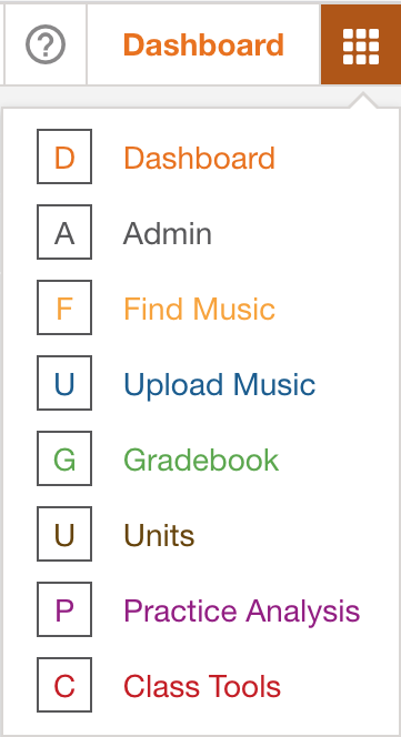
In addition, all SmartMusic features are organized into tabs and submenus, as was already the case in the practice application and the notation editor. Now it’s consistent throughout SmartMusic. Here are some examples:
Find Music
Previously, when you clicked on Find Music, you would sometimes arrive at the Search page, and in other cases you’d see the Exploration page. Now all content-related features are clearly organized into three tabs: Explore, Search, and a new Uploaded Music tab that displays all your uploaded music:

Gradebook
The Gradebook was getting pretty packed. Its features are now distributed on tabs and submenus. To choose which Gradebook to display you’ll select Platform & Classes. It offers direct access to Class Setting & Tools (Grading Scale, Grading Calendar), the Class Profile (Premium status, class code), and Students.

Also in the above image, please notice that Gradebook Options and Export features are each in dedicated tabs.
Other Examples
The Practice Analysis and Class Tools sections also follow this same logic. Another section to benefit from this redesign is the Admin section, where the double black and orange menus have been replaced by one single bar:

A More Efficient Search
Several improvements were made in the way you search for music.
First, the layout has changed. The filters you specify now remain visible on the left side of the screen throughout your search:
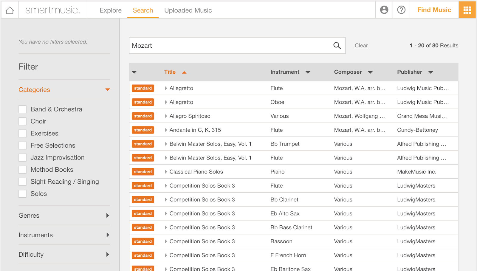
In addition, you can select several filters at the same time. In the below example, we have searched for all Exercises and Solos that are Easy or Medium Easy. Please note that filters are also displayed as little tags at the top so you can quickly remove them if you want.
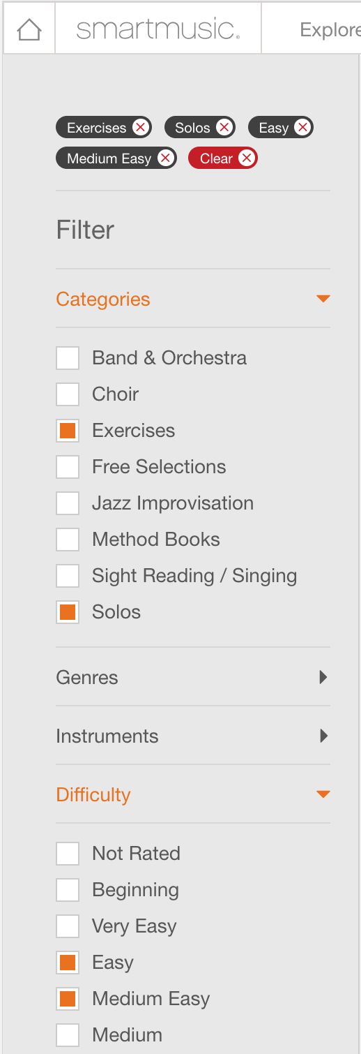
Also, if you make changes to any filters, all results are updated in real-time.
Here’s an improvement made specifically for vocal and choir teachers. We’ve streamlined the voice categories, replacing 14 different options with 4:
- Voice – All
- Voice – High
- Voice – Medium
- Voice – Low
Our goal is to make browsing the growing vocal catalog more efficient.
Improving the Assignment Process
We’ve made the assignment process more efficient. You’ll see two major changes:
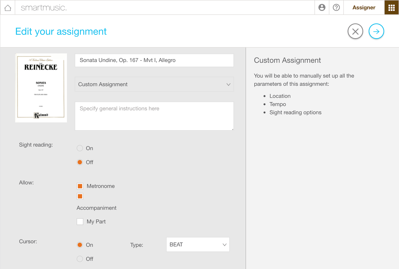
1. Global parameters are set on the first page
When you create an assignment, you’ll use the first page to set up parameters that apply to all the parts of the assignment. It will no longer be necessary to copy things like sight-reading options or the exercise key from one part to another. In addition, we’re excited to offer more flexibility in your assignments. Now you can choose whether or not students can access “My Part” and/or the accompaniment for each assignment. You can even decide which cursor and measure type the student will see.
2. Apply the same setup to all parts with one click
Most teachers duplicate the parameters of one part to all other parts. As a consequence, the new default setting will be to use “Same setup for all parts.” Tempo and Location will automatically be copied to all other parts.

When needed, custom setup for each part is still available, and the copy controls are much more intuitive.
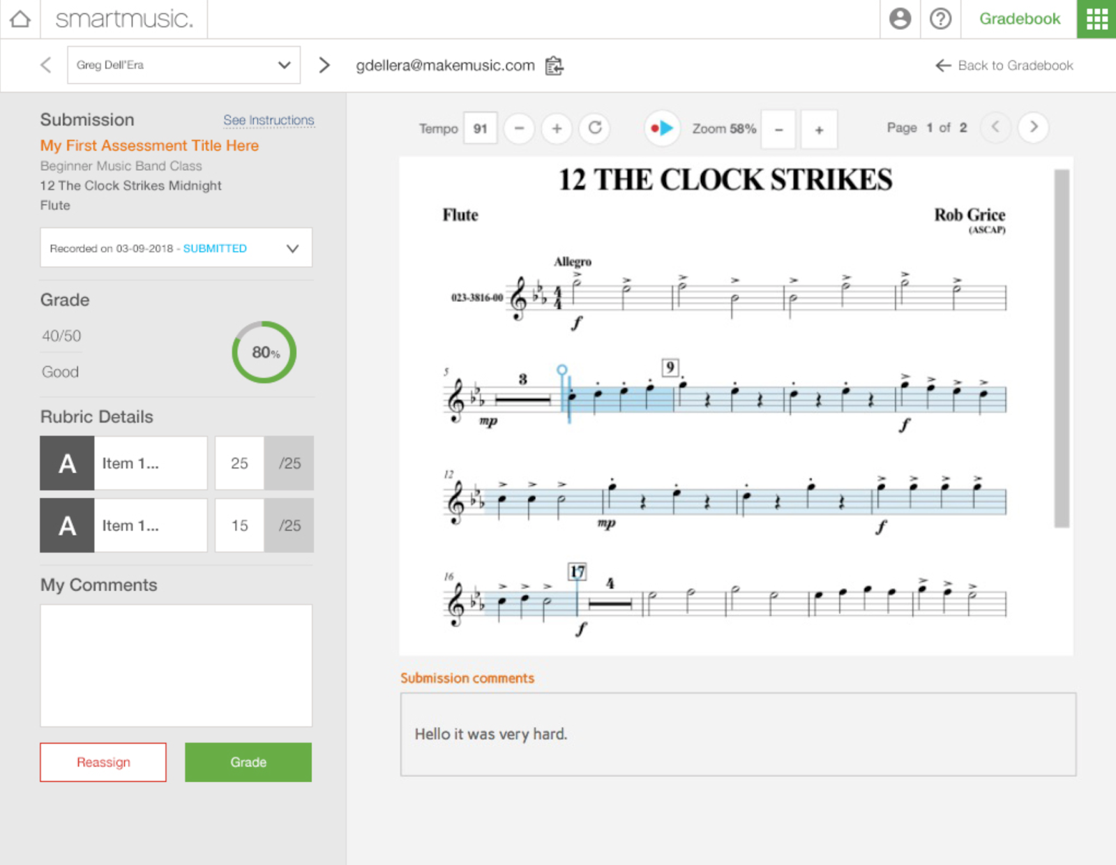
A Redesigned Grading Page
We’ve made the all-important grading page more convenient and user-friendly. Now you can:
- Navigate between all students for a given assignment through a dropdown list at the top of the page
- View your instructions for any assignment by clicking on “See instructions”
- See at a glance what instrument each student used for their submission
- Find student comments below their submission
Thank You
These updates were all inspired by feedback from you and your fellow educators. Thank you so much for your continued support and input. Please continue to submit and vote on your favorite feature requests and see what’s coming next in our product roadmap.
Don’t have the new SmartMusic yet? Now you can try it for free!